
Harrison Hot Springs Emailers
Harrison Hot Springs Resort and Spa needed an updated look for their emailers to tell their guests about the latest resort deals and packages.
View
Harrison Hot Springs Resort and Spa needed an updated look for their emailers to tell their guests about the latest resort deals and packages.
View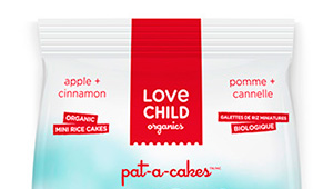
Love Child Organics delivers healthy, organic baby and children’s food products and needed fun, loving and cheerful packaging that would separate them from their competition.
View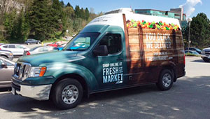
Fresh St. Market decided to launch Fresh St. Connect – an online store allowing users to get fresh produce delivered straight their front door. To ensure deliveries always arrived in style, Spring was tasked with the challenge to wrap the delivery van – so we made gave...
View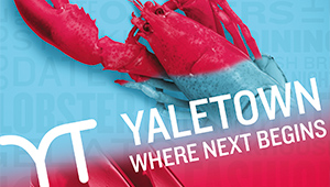
Yaletown Business Improvement Association needed a fresh, modern and fun look to match the vibe of the existing Yaletown neighbourhood.
View
Harrison Hot Springs needed a fun and refreshing way to remind busy commuters that Harrison Hot Springs Resort and Spa was a near-by and fun-filled summer escape for the whole family.
View
The Vancouver, Coast & Mountains Region almost sells itself – but the ad space in its publication was proving to be a bit of a challenge. The Vancouver, Coast & Mountains’ Visitor Guide and Experience Guide needed a facelift.
View
Wax Bar, a waxing and beauty bar, needed posters to advertise that they offer hair colouring services, not just waxing.
View
New Chapter – a health and nutrition company providing organic vitamins and whole food supplements – needed a new look and feel that was fresh and approachable, yet remained trustworthy.
View
City Farmer – an urban farming non-profit – needed an identity and campaign to communicate its grass-roots approach to urban agriculture.
View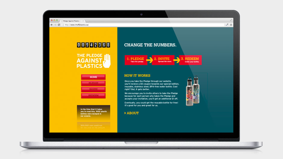
The Pledge Against Plastics is a non-profit environmental/social awareness campaign which needed a complete brand platform.
View
The London based nightclub, Ministry of Sound, was in need of a series of promotional posters to advertise their iconic weekly event Saturday Sessions.
View